Starbucks branding
Conveying meaning through names and logotypes for a global brand’s internal management development series.
Finding the identity
The Retail Manager Development Series at Starbucks is a program consisting of several learning components, including online webinars as well as talks from influential external thought leaders like Brené Brown. My team was tasked with creating the names and logos on a short deadline and with tight guidelines on visual styling.

Let’s percolate…
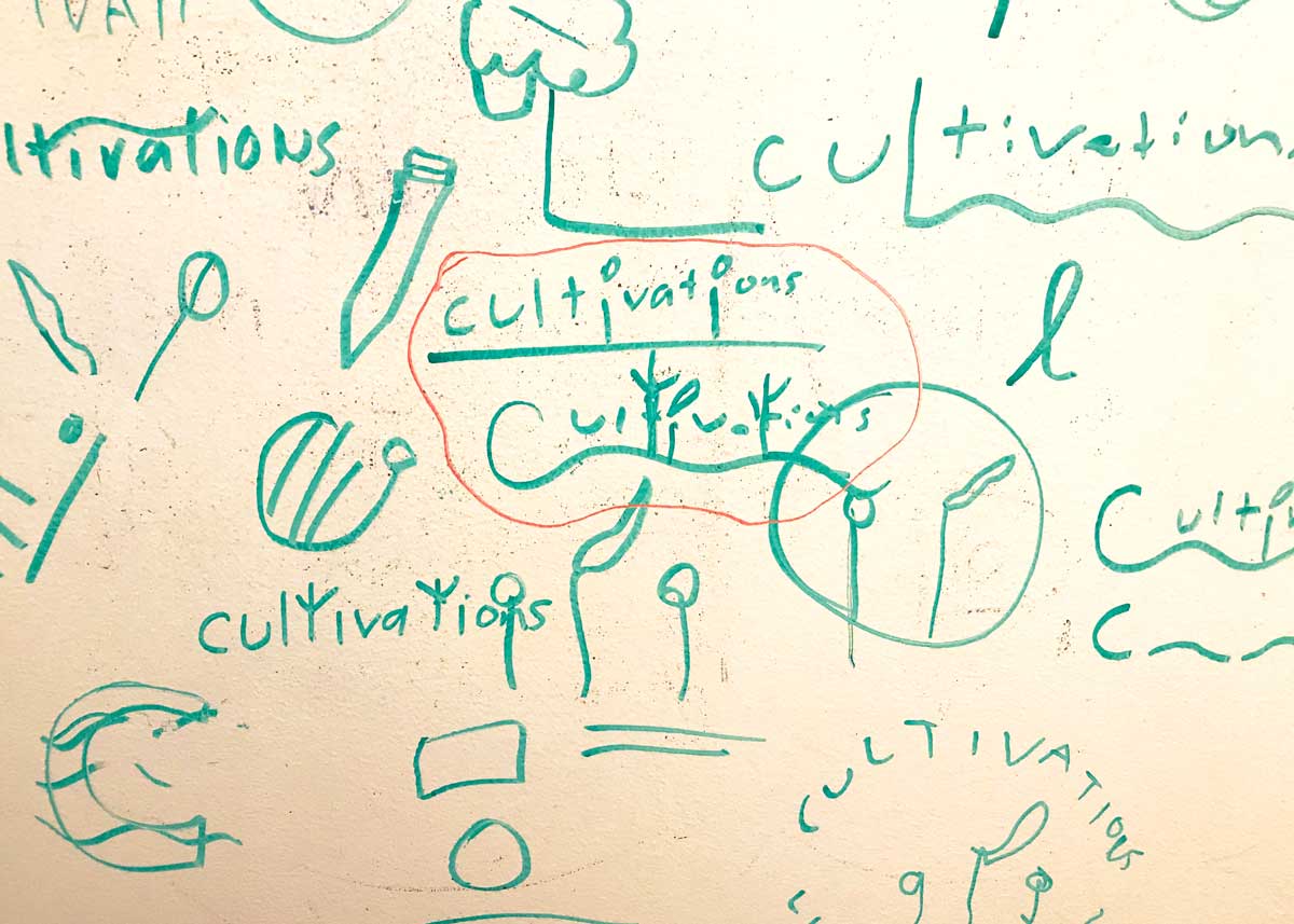
A debrief from stakeholders on the different parts of the program led to naming brainstorms and sticky note sketching sessions with my design partner, Angelo Salgado.
We sought to highlight what made each program component different while keeping a similar aesthetic, and it was key for us to tie the branding back to the spirit of Starbucks. This thoughtfulness and intention led to a successfully designed and delivered final product.
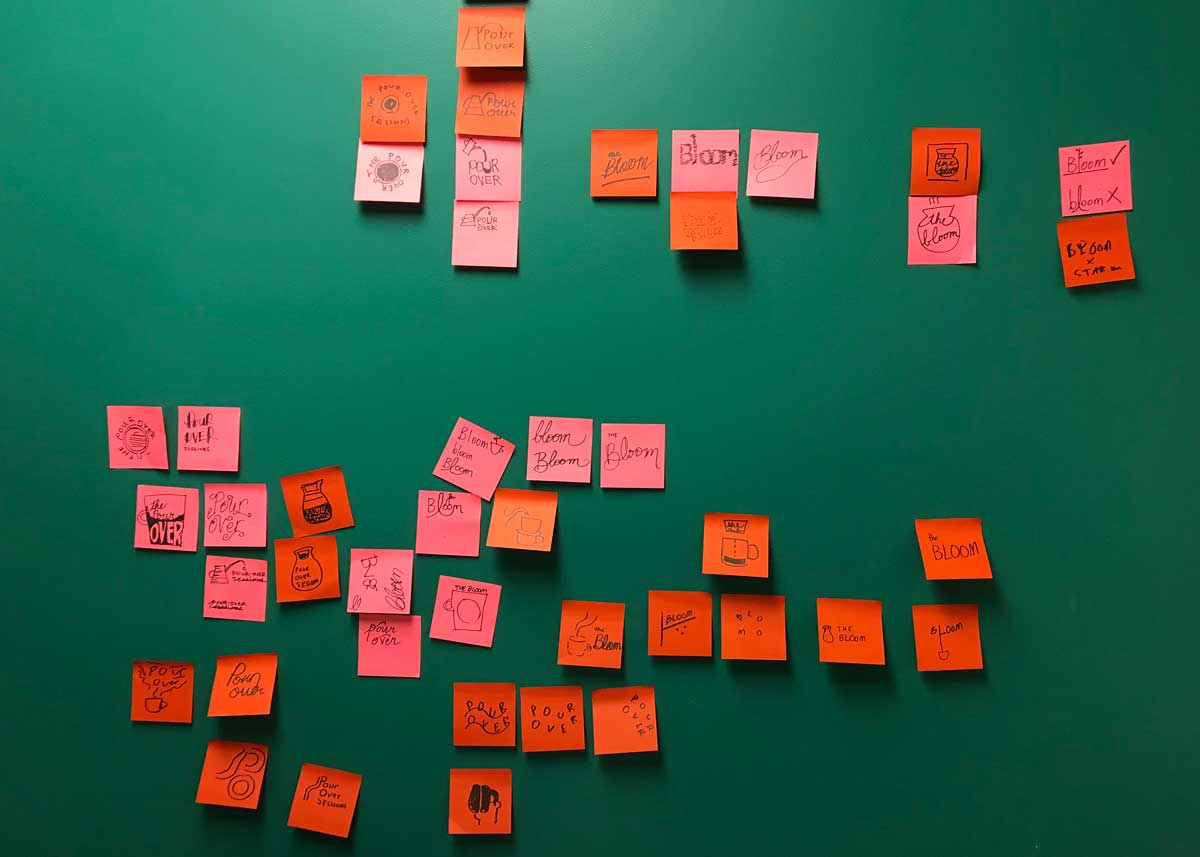
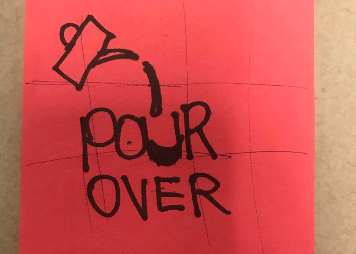
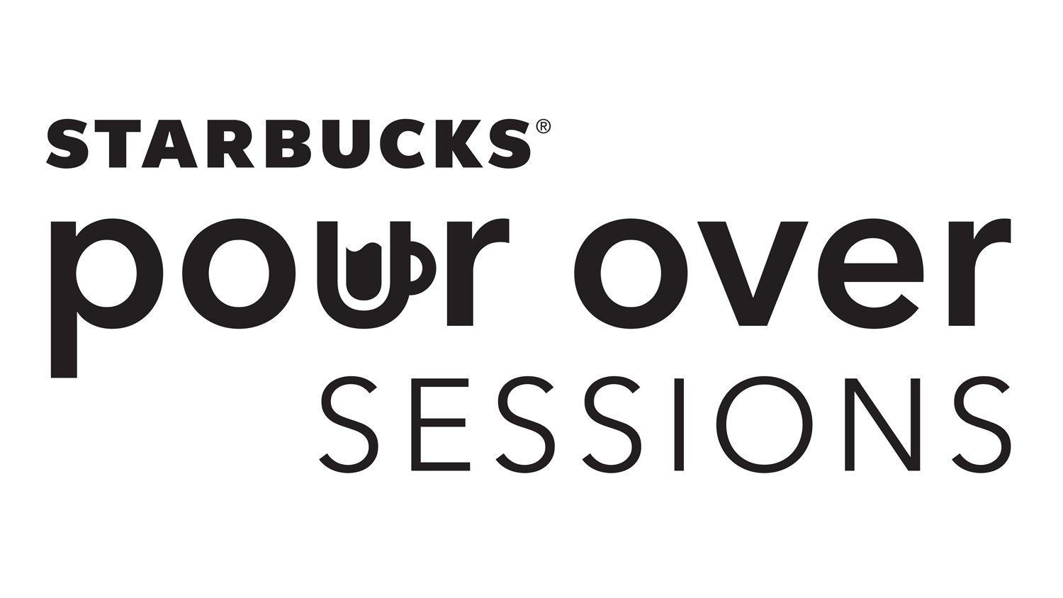
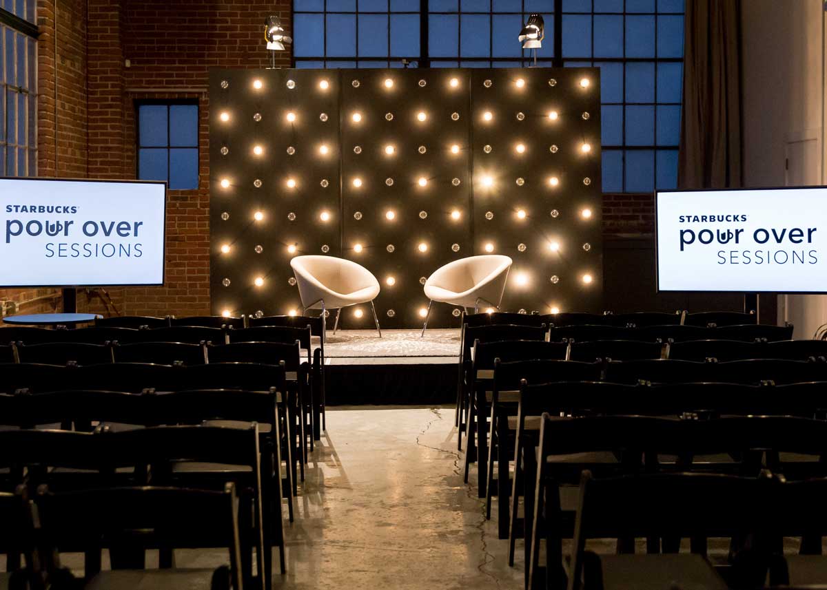
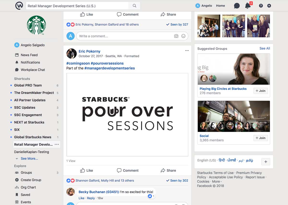
The Pour Over Sessions are a series of inspiring talks from external thought leaders meant to help managers understand how to bring The Starbucks Experience to life in their stores and for their partners. These sessions cover topics and themes that ladder up to the Starbucks mission and values. Think TED Talks, but with a Starbucks flavor. The name combines a term used for a specialized form of brewing coffee with the notion of “poring over” a subject.
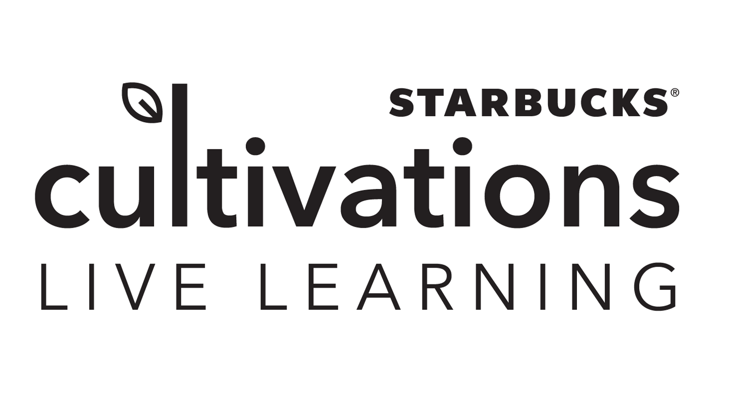
The Cultivations Live Learning component of the Retail Manager Development Series consists of online webinars that help to reinforce skills and behaviors. It’s an interactive learning experience that pulls in real-world examples to build leadership capabilities in participating managers. The name and logotype combine to give a nod to growth.
